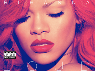
Here is the cover for Rihanna's new album LOUD. This is one of my favorite covers i think the colour of her hair and lips just make it pop. I also think that the fact she has her eyes shut quite quirky as the cover normally relies on the artists eyes to lure the audience in.
They have chosen very subtle lettering which i like because it keeps the photo the main focus. They have also included the label title which is quite a focal point due to the colous they have chosen.
Here is one of the many pictures inside of Rihanna's album. Its one of the more controversial pictures as she isnt wearing anything other than flowers and fur. i like the element of rebellion in this picture and think that this sort of thing would fit i was making a real digi pack for the characters we have made up, but as not all the girls are over 18 and its a school project i think it would seem slightly innapropriate. But i do think that a digi pack needs an element of surprise and edge about it.
This is another picture which i think is nice in the digi pack. I think its good because its suits the writing in the background. Of course its far too feminine for what we are looking for but its worth taking into account because the pages dedicated solely to writing are good. The white fluid lettering looks nice and is quite dramatic, i look at the page and want to read it.
yet another nice picture, the floaty dress and the red hair are contrasting to the forest around them her position where she is looking away from the camera. the conventions of the picture doesn't necessarily draw the audience in but the way she is holding the dress and how her arms introduce the picture (almost makes u pan up to her head) make it interesting.
Here is another picture that is slightly more provocative, i think that the tattoo looks really good in this. I think the position is far too animalistic for something that we are trying to acheive but i think it has been well stylised for Rihanna's music.
This is one of my favourite pictures in the digi pack because it has depth and a nice effect on it. The feathering has made the photograph look a little blurry. and with the lettering that just blends into the background adds a really nice effect. I would like to take this idea and adding subtle tilted writing.


No comments:
Post a Comment